Bye Bye, Tai Ping

Today’s digital choices makes decisions so varied, it can almost be a problem making a final decision. Client involvement means further changes and not always good. People like to be able to make a contribution and they don’t know what they want until they see they don’t want that.

Tai-Ping

Tai-Ping

Tai-Ping

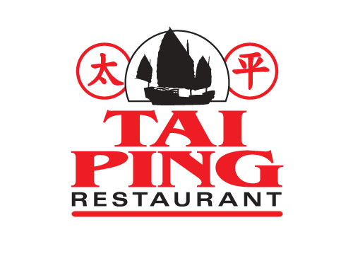
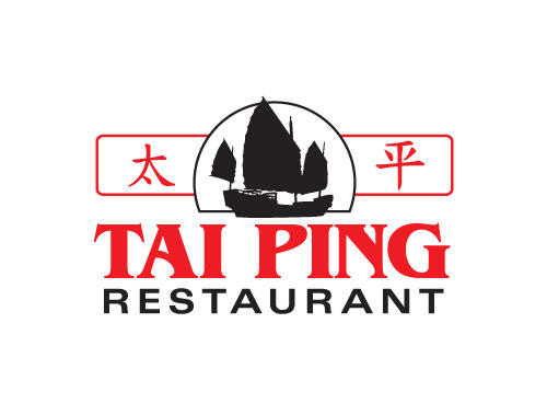
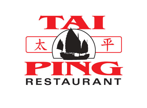
Take for example the above images for a local restaurant take-out menu header. [2015-ish] It’s easy to make changes in digital, make new shapes and try a dozen different good choices while working. The final choice by the owner was it was too fancy and looked too expensive and so he decided he didn’t want to change after all, so the design was tossed. All in all I did ten or so designs with variouus type faces and they only took a couple of hours of computer time. Not at all a huge loss really. Had it been from sketches to line art, it would have been a week or more just for an initial presentation and $$ out of pocket.

Not that I would have charged Nelson for a design. After over 15 years of hanging at Tai Ping, I consider him a friend. The place is gone and I will always miss him and his ‘home’ cooking, It always felt like he was doing it just for me.

The Tai Ping has gone the way of so many restaurants – victims of Covid-19. I hope we can meet again.

I Miss You, Alpha Diner

Alfa Diner web image

Alpha Diner was a little breakfast place near Tunney’s Pasture, that closed up a few years back. I miss Danny and his mom & dad. They were the ultimate mom&pop place for simple eggs, bacon, coffee and toast … although I don’t do toast or bacon.

This design above was for the web site I built for them [2009ish]. They had so many designs for this place. There was one on the menu and at least 5 more hangin’ around the place. I took photos of them all and taking the best, made this version. There never was anything official for branding but it was the sort of place it didn’t matter. Danny was happy with every version, as long as the name was spelled right.

The site was one of my first and was built in WordPress. It had directions, the phone number and the menu. That’s it.

I was just thinking about the place yesterday [Groundhog Day]. Alpha’s disappeared in a real estate buy-up.

Digital Means Flexible

Vector Butterfly black
Vector Butterfly blue
Vector Butterfly green
Vector Butterfly red

[school assignment ~2007]

Being able to produce artwork quickly in digital means being able to change your mind as quickly as you work. It’s a freedom that has accelerated production of finished premium artwork.

Working in black & white means flexibility in colour choices, adjustable size and seeing your work in finished format on web and printing to paper to see immediately what is good and what isn’t.

Even just 20 years ago, choices in typography meant you had to choose upfront on size, font families, line spacing; send it to the type house to get set into galleys of text to be pasted up on art board to photograph to film for print. A long and expensive route to finished product.

I started in the time of true cut & paste, photo stats, rubylith and camera tricks. This digital stuff is such an improvement in many ways, but it won’t replace the sketch & think for day-dreaming ideas.